Batbaik
Redefining a brand to show what a direct air operator already does on the ramp: strategy, identity system, website creative direction and Instagram activation.
Context and vision
Batbaik is a direct air operator holding an Air Operator Certificate (CESA) issued by ANAC, Argentina's civil aviation authority. It has its own hangar and operations base at San Fernando International Airport, a second base in Mendoza and two aircraft in service: a Learjet 31 for corporate transport and private flights, and a 19-seat Metro 23 for corporate logistics and mining and oil & gas projects.
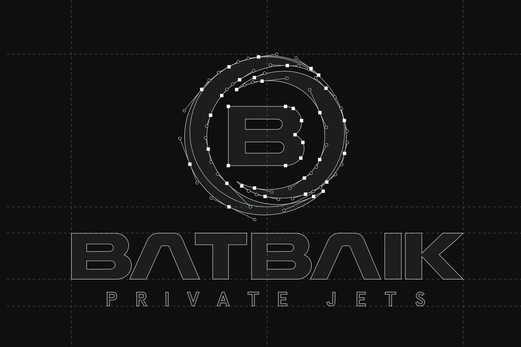
Its communication, however, came from a different register: that of luxury charter. The company wanted to win contracts with energy and mining companies, which vet their suppliers before they call and need to know whether they are dealing with an operator or a broker. The challenge was for the brand to show what Batbaik already does on the ramp every day, with one starting condition: the logo would stay, by the company's decision.
Strategy
We started with an insight session with Batbaik and a brand survey: an extensive questionnaire in which the company shared its view of its business, its goals, its audiences and its current brand. With those answers we audited the existing brand (logo, palette, Instagram, website and messaging) and, in parallel, researched its context: the evolution of non-scheduled aviation in Argentina, the demand driven by Vaca Muerta and mining, and the safety standards those industries require from their suppliers.
We interpreted and synthesized these inputs in the brand platform, where its positioning was set out as follows: “Batbaik is a direct air operator offering executive and corporate transport and strategic air logistics with efficiency, safety and reliability, for companies in the energy and mining industries and for private passengers.” The platform is organized around four communication pillars (Direct operation, Verifiable safety, Efficiency and reliability, and Operated destinations) and defines a key message for each audience.
The focus shifted from luxury to technical and operational strength, and was summed up in one overarching message: “Efficiency, safety and reliability on every flight.”
- 01Insight sessionAn initial listening session to understand the business, its goals and its context.
- 02Brand surveyAn extensive questionnaire: the business, its goals, its audiences and the current brand, from the client's perspective.
- 03Audit of the current brandWhat to keep and what to transform in the new identity.
- 04Market researchNon-scheduled aviation in Argentina, Vaca Muerta, mining and the safety standards they require.
- 05Brand platformPositioning, four communication pillars and a key message for each audience.
- 06Overarching message“Efficiency, safety and reliability on every flight”
Identity
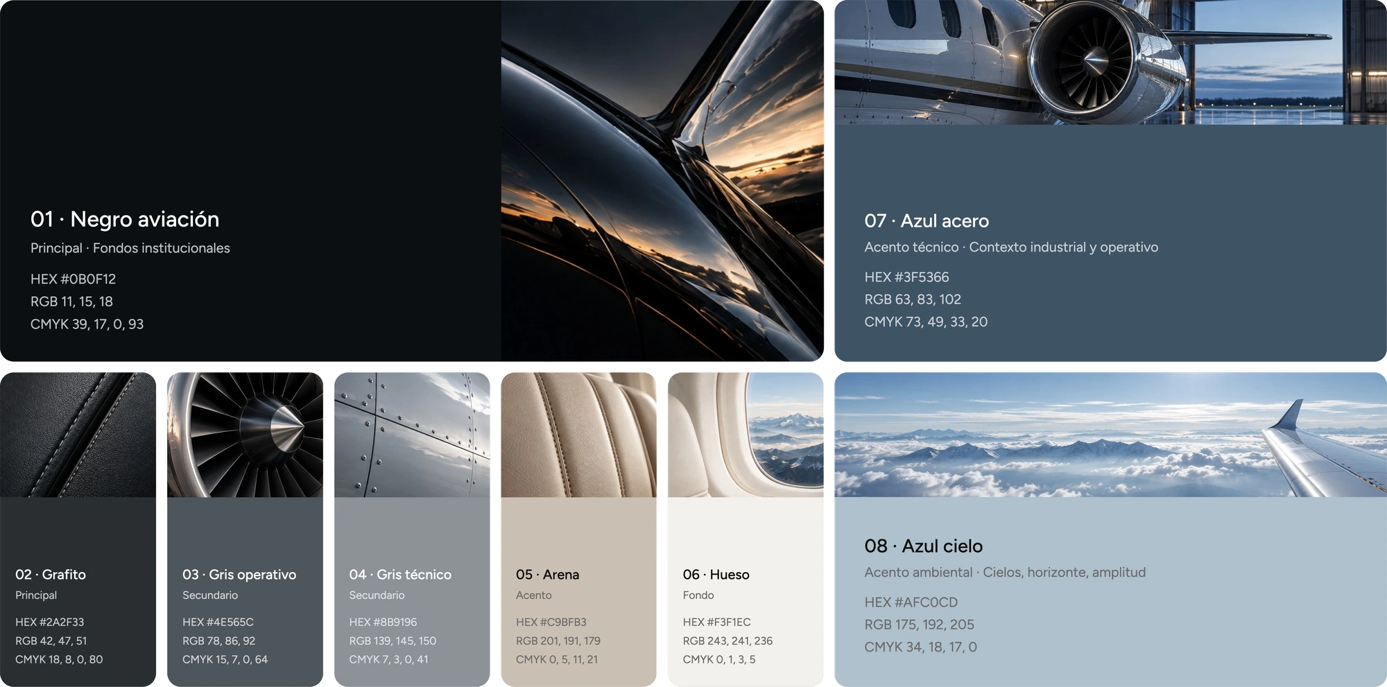
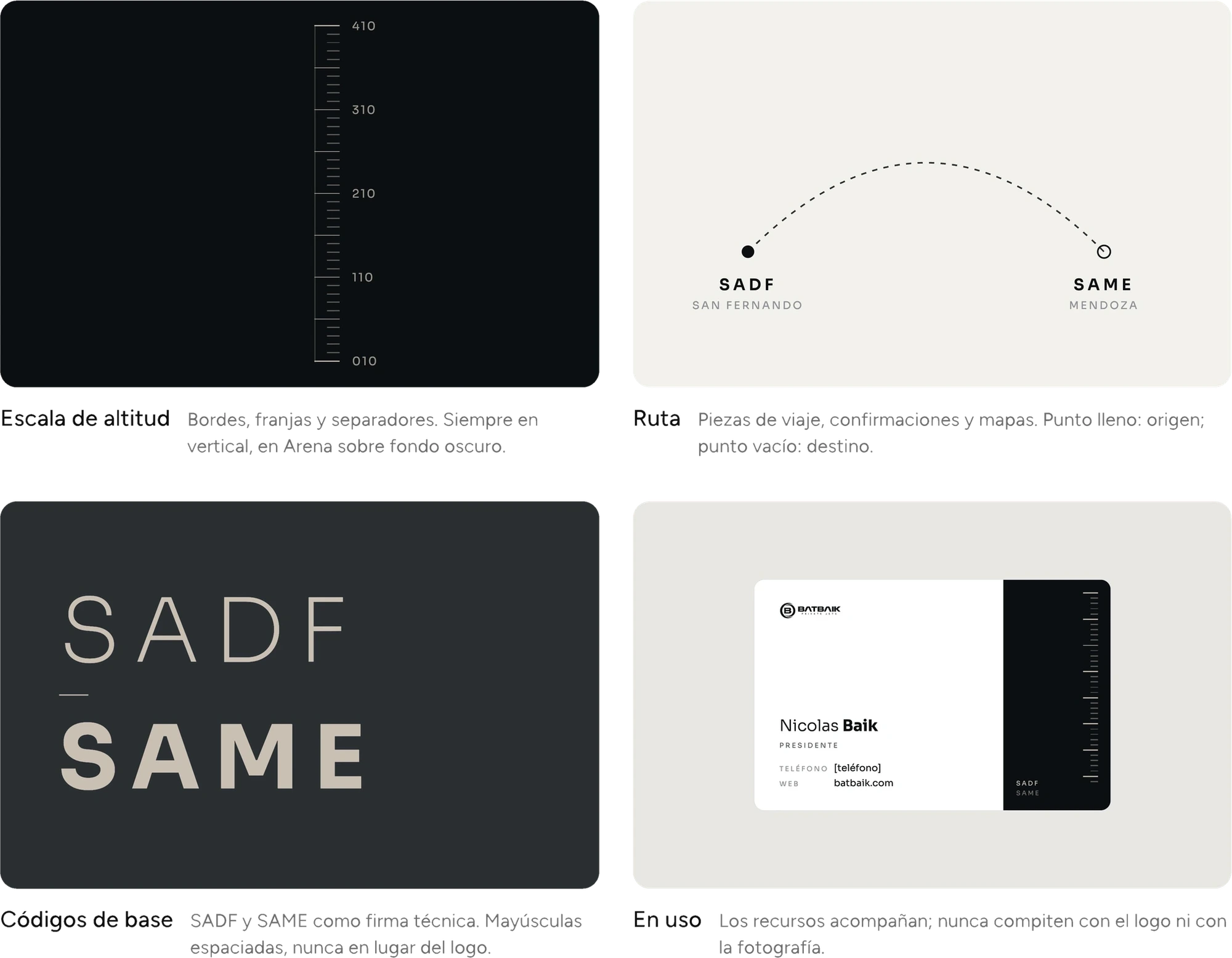
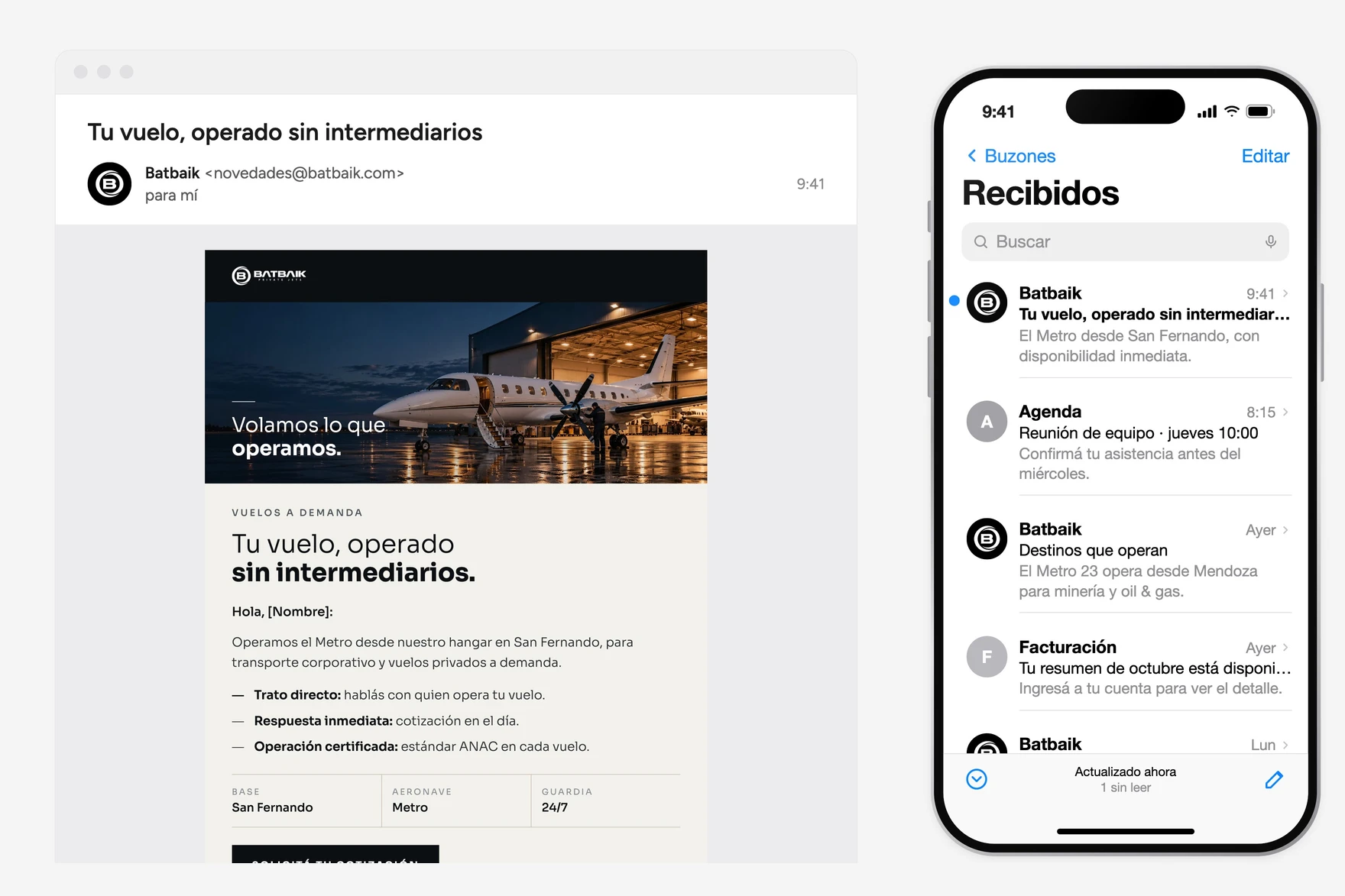
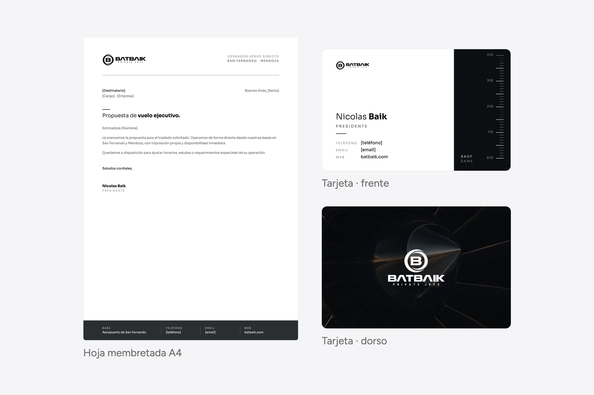
Our job was to build around the logo the system it lacked: a restrained, dark-based palette with Arena as the accent; Sora as the single typeface family; graphic resources drawn from flight instruments, such as the altimeter scale, the route and the SADF and SAME codes of its bases; a custom iconography and a photographic style centered on real operations. The palette starts from the direction the company asked for, with dark tones, technical grey and neutrals, and links it to the actual materials of the aircraft. The verbal identity supports that shift, with a precise, clear and professional tone that puts facts before adjectives. Everything was codified in a brandbook and an applications workbook.
Implementation
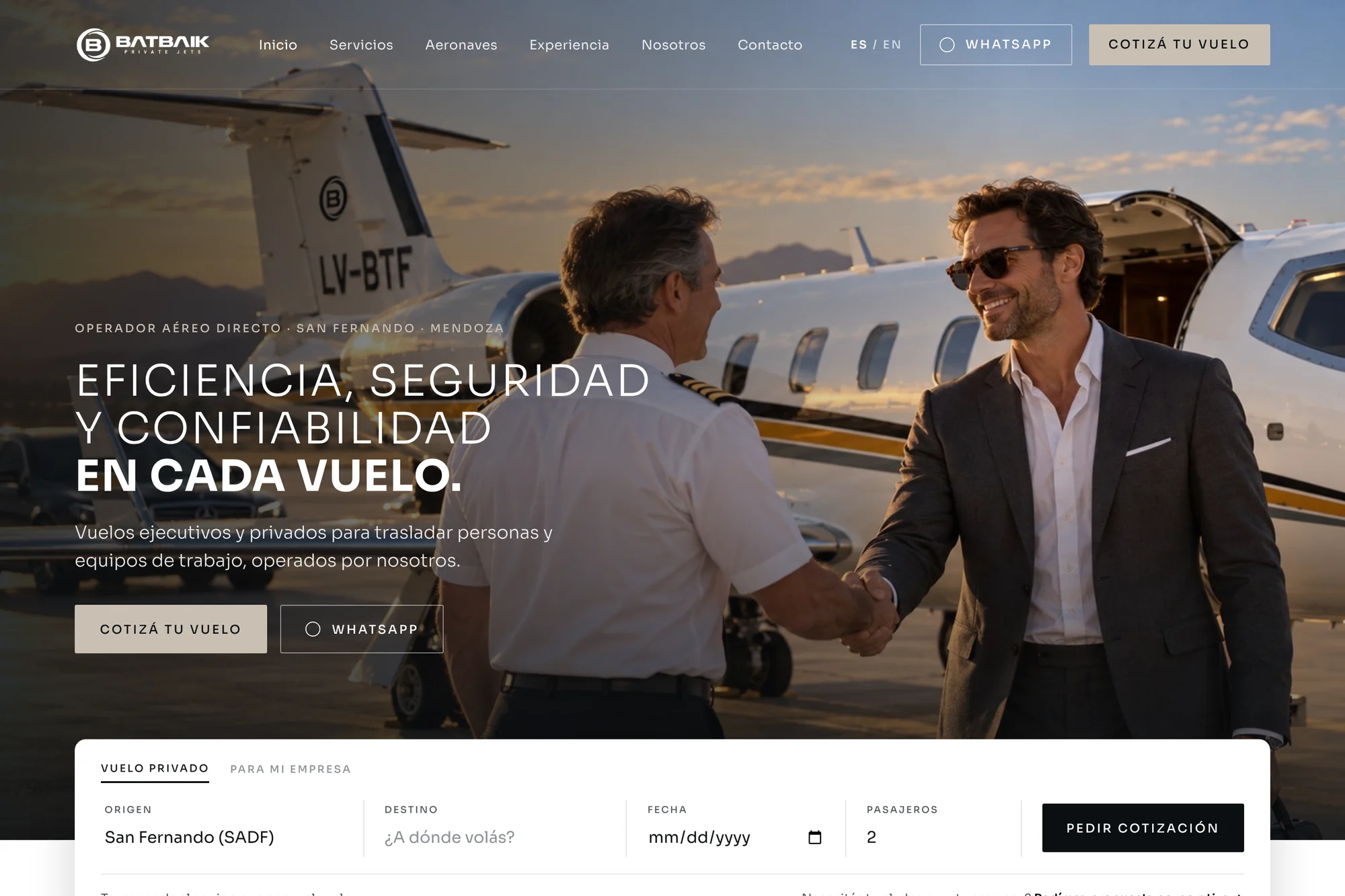
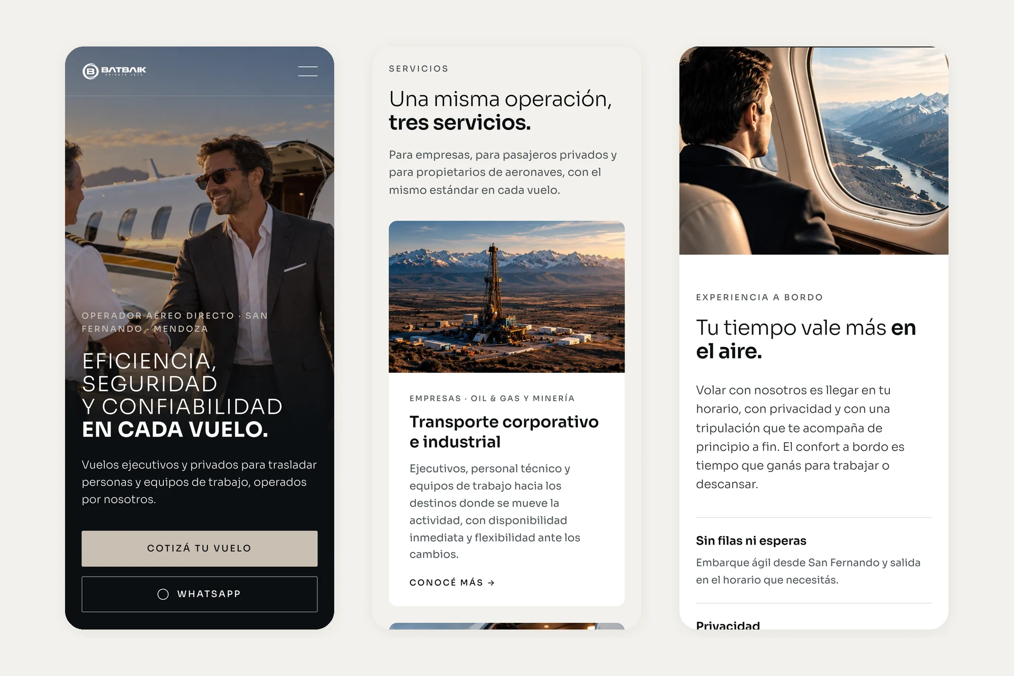
With the brand defined, we led the creative direction of the new website, which Batbaik's in-house team is developing. We defined the architecture, the copy for each page and the visual language, so that the web experience carries the same coherence as the new visual and verbal identity. The site speaks first to the corporate buyer, who needs to confirm in under a minute that they are dealing with a direct operator, and offers a dedicated contact path for private passengers.
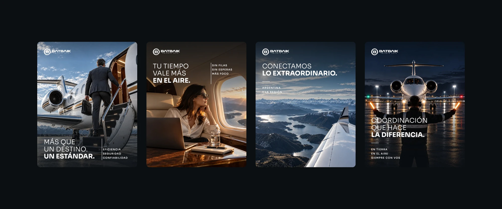
In parallel we activated Instagram, the showcase of its real operations, with monthly planning and community management of organic strategic content, organized around the platform's pillars, to position the brand in the corporate and industrial sector.
Scope of work
- Insight session
- Brand survey
- Audit of the current brand
- Market research
- Positioning and brand platform
- Color palette and typographic system
- Visual and verbal system
- Iconography and graphic resources
- Corporate identity
- Brand guidelines (brandbook)
- Applied visual guide (workbook)
- Creative direction of the website
- Digital communication strategy
- Monthly content planning
- Strategic community management
- Control of visual consistency and brand narrative
- Monthly reporting and optimization
- Digital communication consultancy


Share: