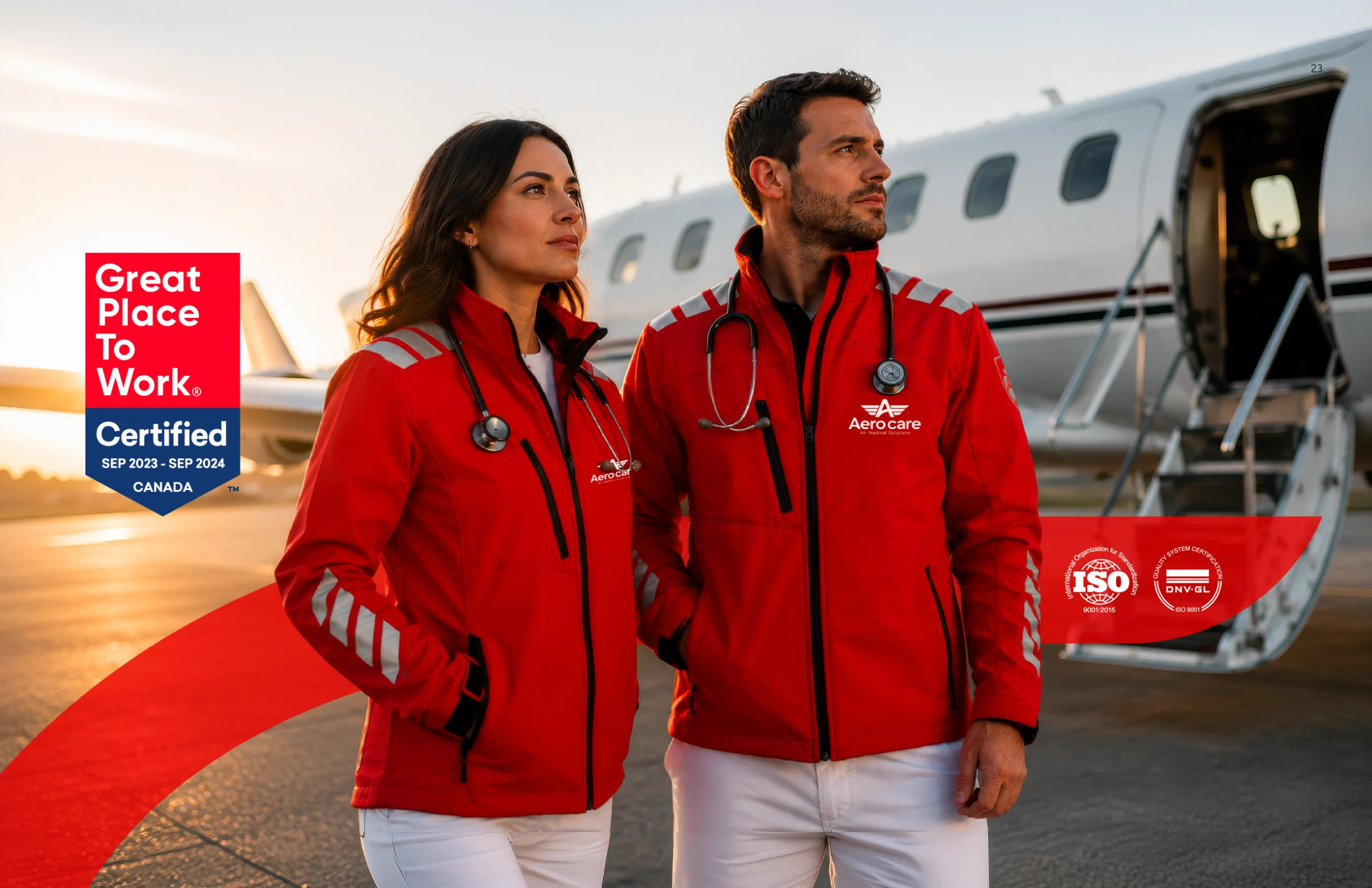
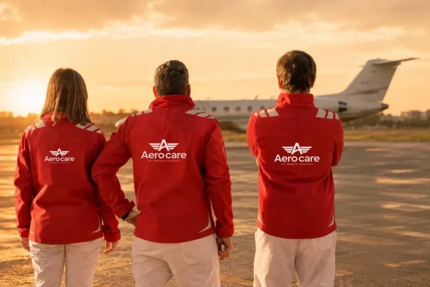
Aerocare medical crew wearing the brand's jackets next to the plane
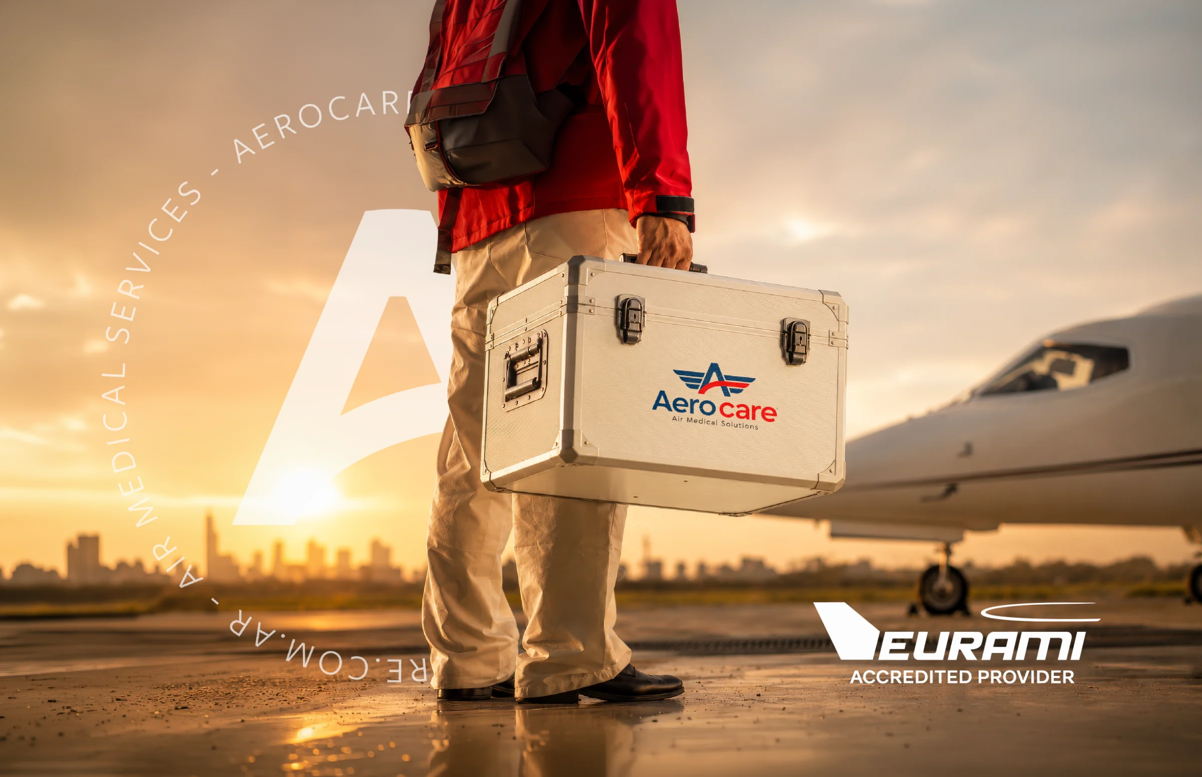
Aerocare medical bag with EURAMI seal

Context and vision

Aerocare was founded in 2020 and grew steadily on the strength of operational excellence and medical judgment, backed by international certifications such as EURAMI. Today it leads the region in aeromedicine and emergency transport, but its brand had not kept pace with that growth.

It relied on the aircraft and on a literal message, “Volamos por la vida” (“We fly for life”), at a time when the company was already handling emergencies by air and by land for insurers, assistance companies and patients. The challenge was to reposition the brand: to decide what position it occupies and what it promises, before thinking about its image.

Strategy

Before designing, we understood where the company was heading. We began with an insight session and a brand survey, the extensive questionnaire in which the company's leadership shared its view of the business, its goals, its audiences and its current brand. We then audited the existing brand through a technical analysis and, in parallel, researched the aeromedical industry, focusing on Latin America and comparing it with European and North American benchmarks.

These inputs were interpreted and synthesized in the brand platform, where we redefined its positioning: “Aerocare is the Latin American aeromedical operator with verifiable international standards. It resolves critical health cases anywhere in the world, with its own medical criteria, globally recognized certifications and end-to-end execution capability.” That execution combines air and ground transport, and continues until the patient is admitted to the receiving hospital or reaches their destination on the ground.

From there we built the rest of the platform around a central challenge: speaking to two very different clients. The institutional client, the main focus of the business, is the company looking for a reliable solution for each case. The other is the patient or their family, who need a transfer at a critical moment. For each one we defined its own value proposition, tone and language, together with the brand’s purpose, personality, values and communication pillars.

That idea was distilled into a new slogan: “We solve the critical. We care for what matters.” The focus shifted from the aircraft to resolving each case in full: the transfer, the logistics and the medical care that lies at the heart of what the company does.

ResearchDesignActivate
  1. 01Insight sessionAn initial listening session to understand the business, its goals and its context.
  2. 02Brand surveyAn extensive questionnaire: the business, its goals, its audiences and the current brand, from the client's perspective.
  3. 03Audit of the current brandWhat to keep and what to transform in the new identity.
  4. 04Market researchThe aeromedical industry in Latin America, compared with benchmarks in Europe and North America.
  5. 05Brand platformNew positioning, value proposition, tone and language for institutional clients and patients.
  6. 06Slogan“We solve the critical. We care for what matters.”
Next stageVisual and verbal identity

Identity

With that platform in place, we designed the new visual and verbal identity to express a broader proposition. We kept what its audiences already recognized, such as the red and the wings, and evolved it into a more contemporary, modular system that is easy to apply. We codified it in a brandbook and an applications workbook.

The new logo is the visible result of work that began long before, with the strategy.

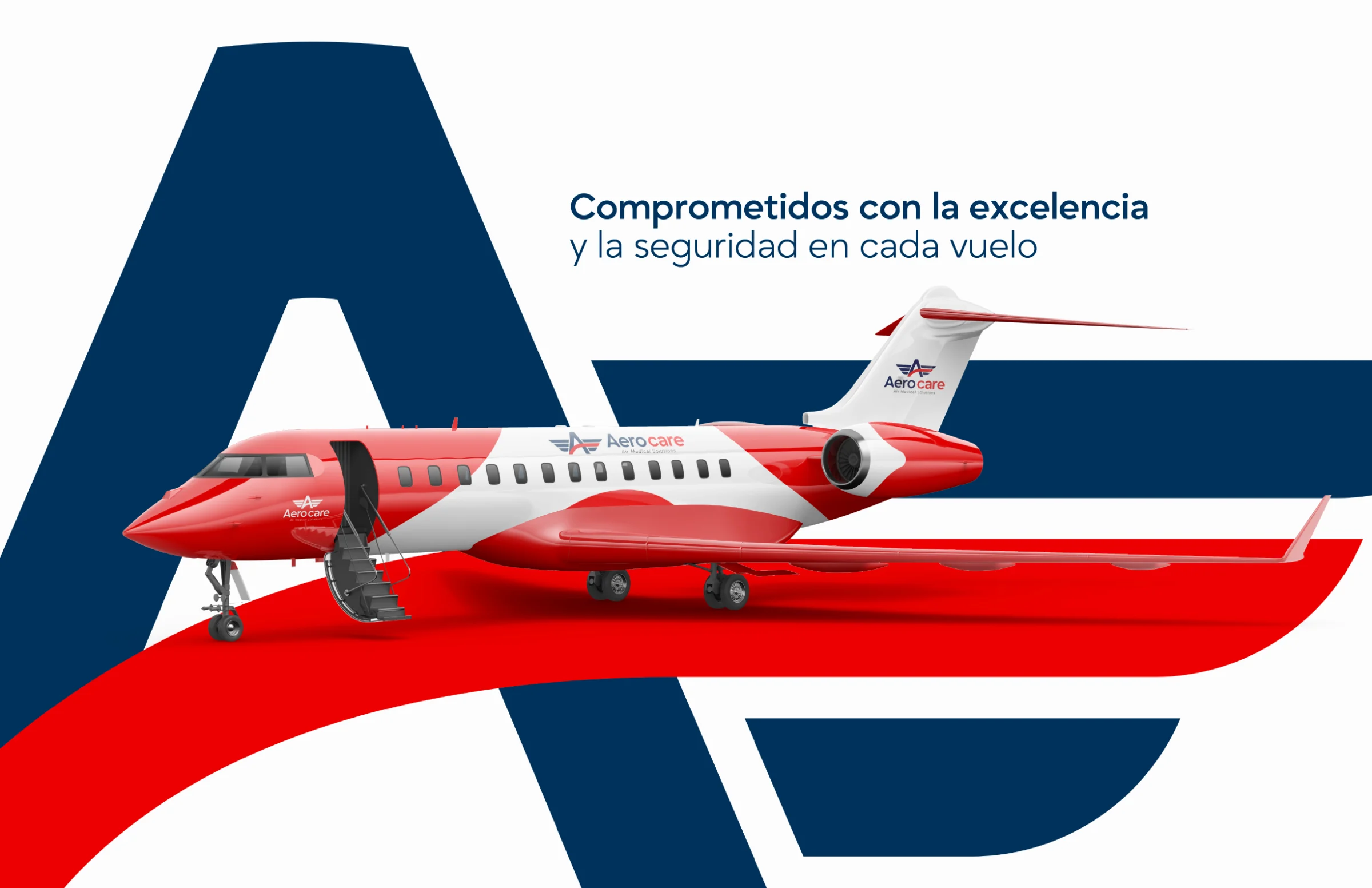
Air ambulance with Aerocare branding
Aerocare Air Medical Solutions Logo
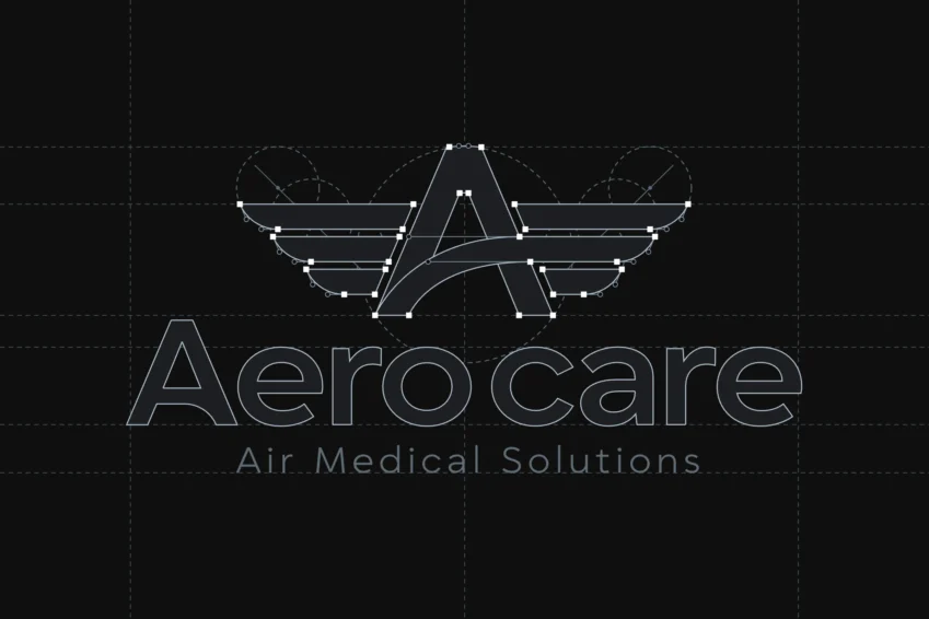
Geometric construction of the Aerocare logo

Implementation

With the brand defined, the first activation was the new website. The need to speak to those two clients, the institutional client and the patient and their family, guided its development: it offers a different experience for each one, one for the company looking for the service and another for the patient or relative who needs to arrange a transfer.

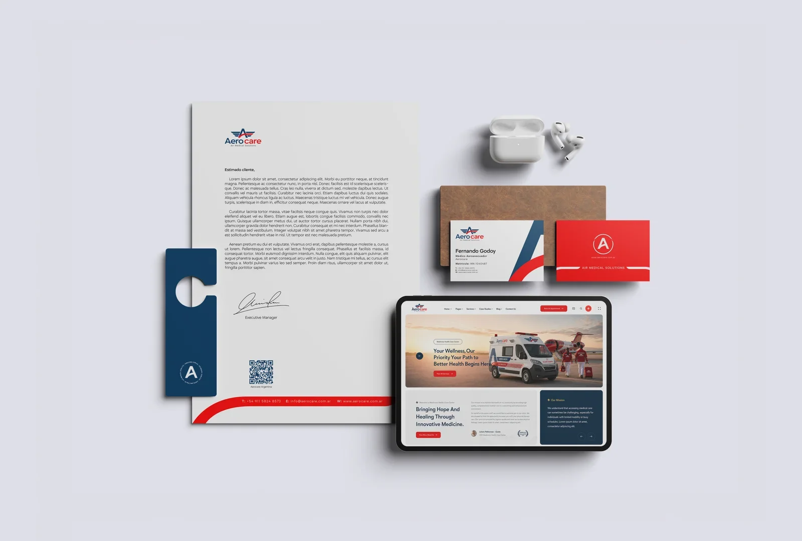
The same approach shapes institutional communication, sales materials and the corporate video. The new identity has also been rolled out across operational apparel and corporate stationery.

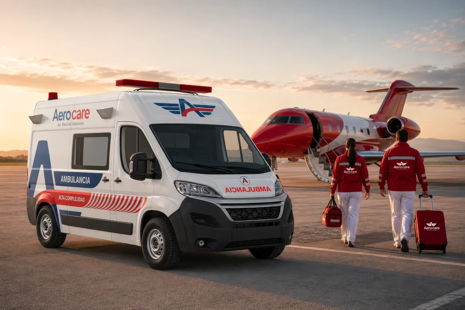
An ambulance bearing the Aerocare logo is pictured next to a medical transport plane.
Aerocare operational clothing with embroidered logo
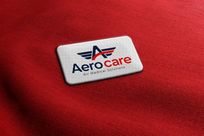
Aerocare logo embroidered on red fabric
Aerocare corporate stationery
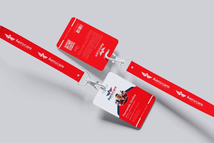
Aerocare ID badge and lanyard
Pins with the Aerocare isotype and logo
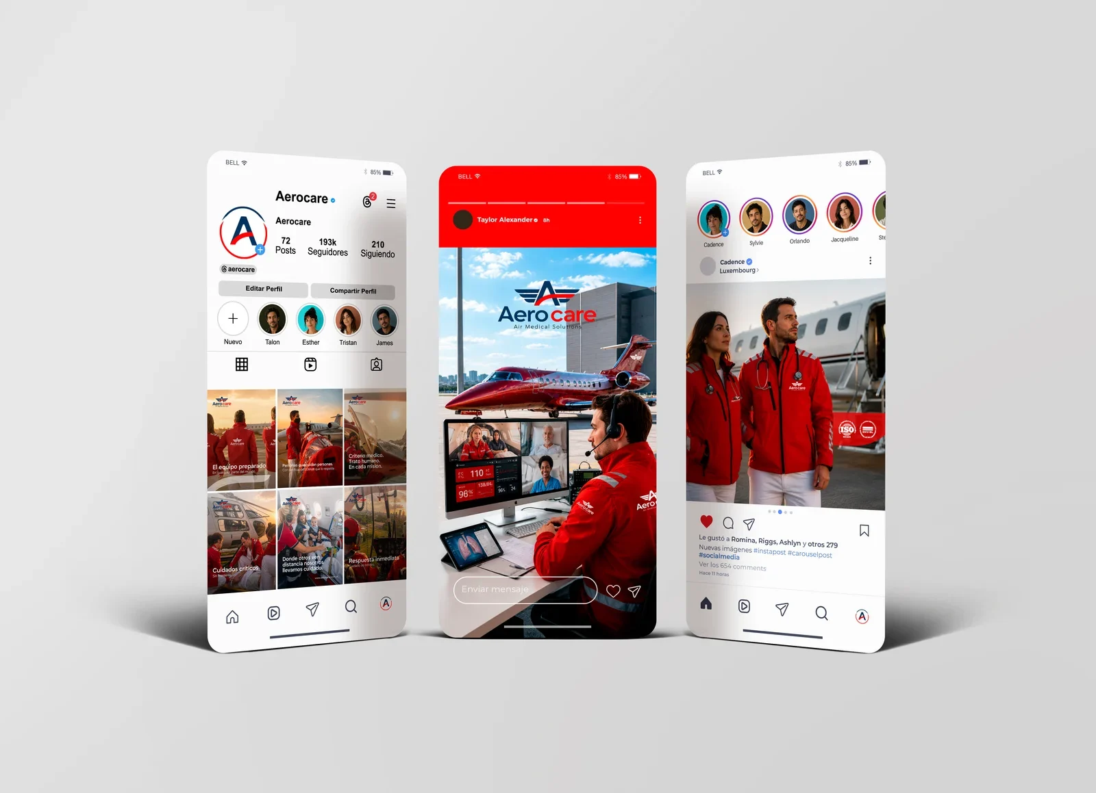
Aerocare social media posts
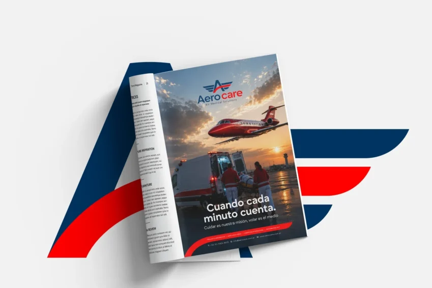
Magazine with the Aerocare identity
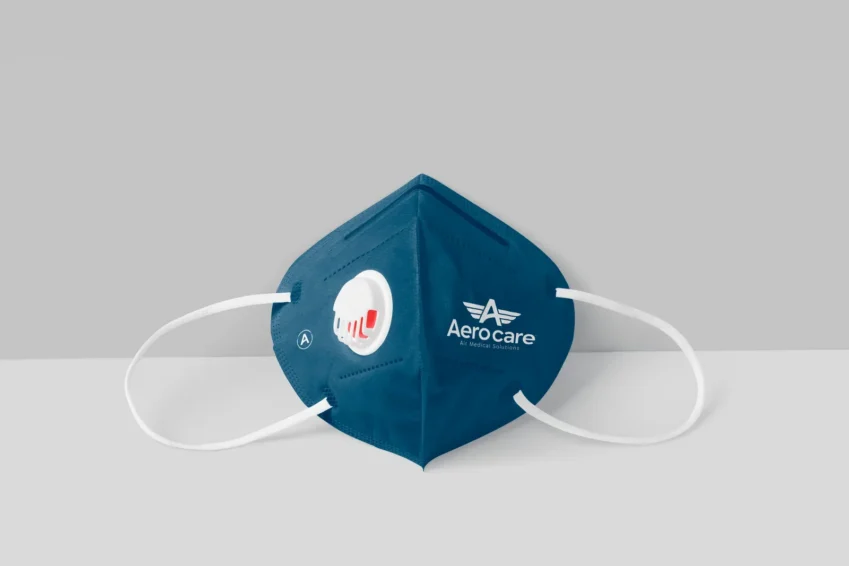
Face mask with the Aerocare logo
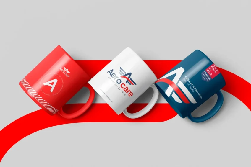
Mugs featuring the Aerocare logo
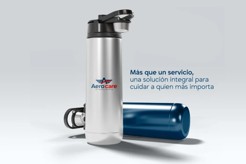
Thermal bottle with the Aerocare logo

Scope of work

  • Insight session
  • Brand survey
  • Audit of the current brand
  • Market research
  • Positioning and brand platform
  • Slogan
  • Logo redesign (symbol and wordmark)
  • Color palette and typographic system
  • Visual and verbal system
  • Iconography and graphic resources
  • Corporate identity
  • Brand guidelines (brandbook)
  • Applied visual guide (workbook)
  • Web design
  • Sales deck
  • Corporate video
Close

An agency that thinks before it designs.

Textured background from the TWG Branding & Strategy visual identity
WE THINK. WE BRAND. WE THINK. WE BRAND.